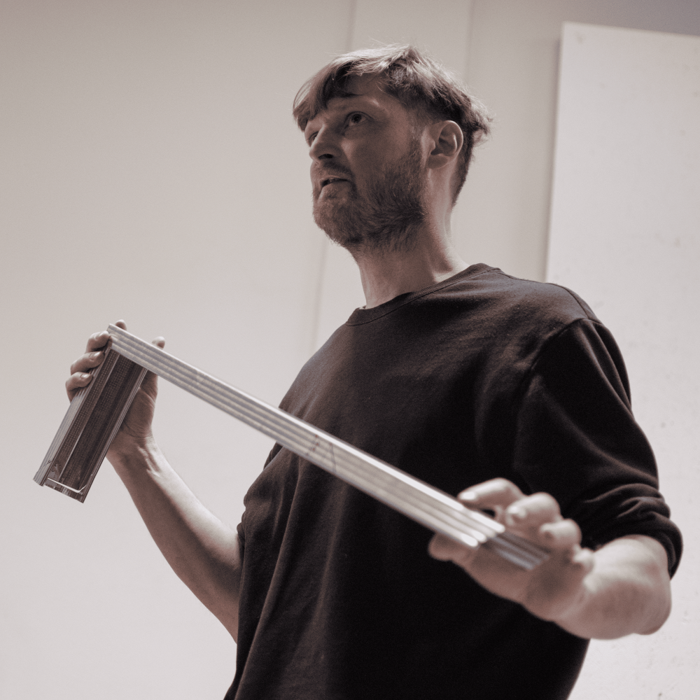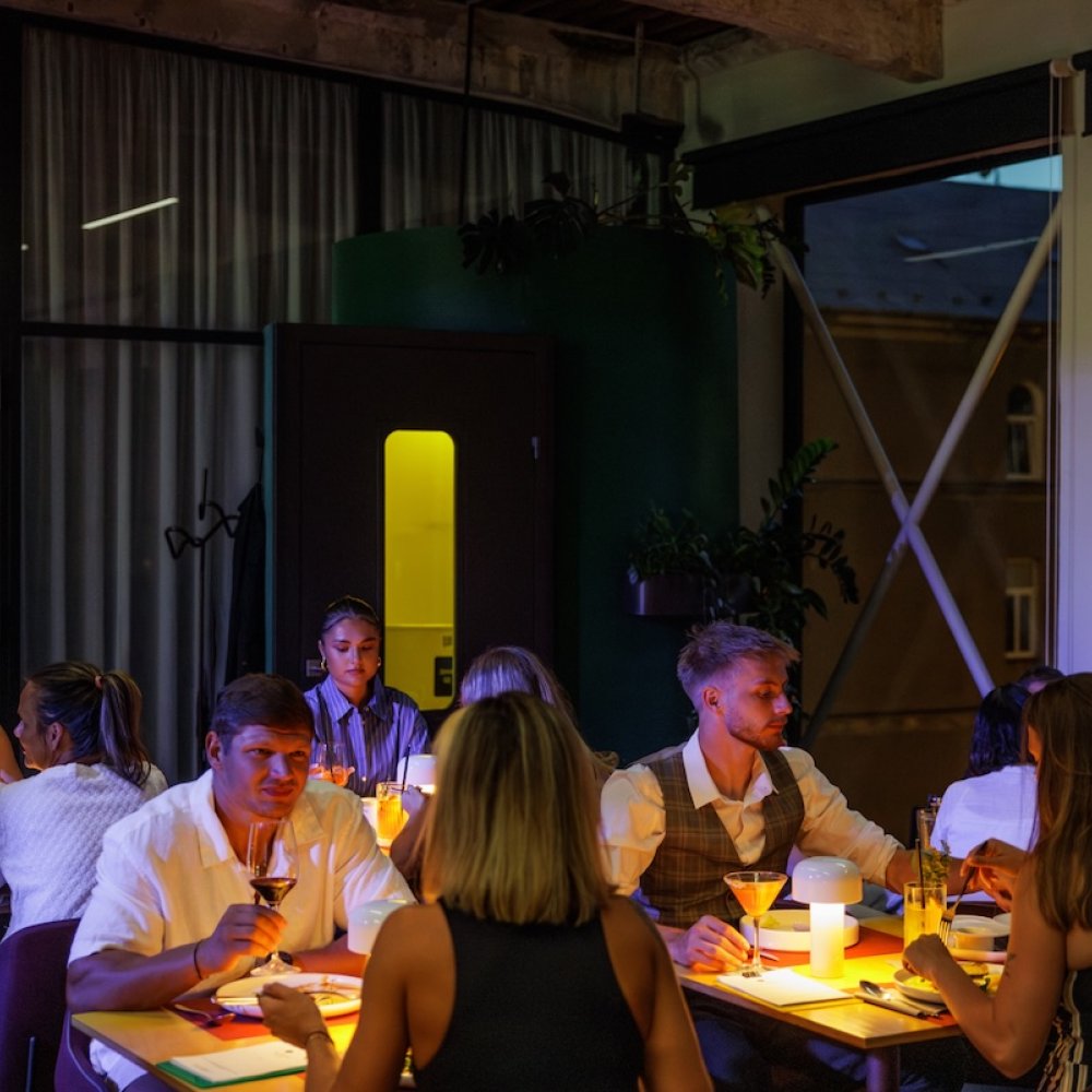
In addition to its historic building, which was used as a telegraph factory a century ago, the Telegraph multifunctional platform is unique in its design and visual communication. The original and innovative approach to the overall visual identity was prepared by designer Jakub Kovařík.
Jakub, how did you choose the Replica font to represent the Telegraph?
A lot of fonts are pretty annoying on second glance. I was looking for a font that wasn't too fancy, as they say, not too garish. Neutral at first glance and interesting at second. At the same time I was looking for a font that would be related to Telegraph in its concept. The replica was designed by the Swiss studio NORM and is drawn in the reduced grid of Fontlab. Normally this grid has a resolution of 700 x 700 pixels, whereas Replica is based on a reduced grid of 70 x 70 pixels. This formal limitation greatly reduces the drawing possibilities of each character. The grid is then no longer just a neutral background, an invisible drawing canvas, but becomes a kind of co-player, a co-author of the character of the font. It's as if a distinctly pixelated photo were used. The language behind it is confessed. And in that I see a certain parallel to the Telegraph's visual.
What was your inspiration in creating the visual? Was it any international cultural centres, institutions, galleries? Or did you try not to look at other galleries to avoid being influenced by them?
One is always inspired. He's reaching out to others. There was no specific inspiration there. Partly like the Nottingham Contemporary gallery website, their tile system, but that's more conceptual stuff than what something specifically looks like. Of course, you look at how other galleries and museums do it. I was more interested in the principle of the telegraph - as a device for transmitting messages, encoding, decoding, and its language. The telegraph is not just what one usually thinks of as a telegraph, i.e. a Morse radio telegraph, but a whole range of electrical and optical devices. The telegraph is both a device and a communication principle. Telegraphs are all methods of communication at a distance, from tamtams and fire signals to electric teletypewriters. It ends with the digital transmission of information, but even there the principle of distance transmission, formal language and technological device for transmitting information remains. This inspired and intrigued me. The main inspiration is in the telegraphic encoding and decoding of messages. And also in a certain possibility of misunderstanding, as happens with silent mail, loss of information and information noise.
In the visual identity presented you describe that the Telegraph has virtually no one representative logo, but communicates through 4 basic elements such as symbol, name, colour and font. How did this strategy come about?
The Telegraph doesn't have one logo, that's true. The way I described it may sound unnecessarily hyperbolic, in fact it's quite common practice today. It has to be. Graphic design has to be able to adapt to the platforms it appears on, speaks on, online and offline. There are always some that come and go. So the language of graphic design really has to be very hybrid, soft, adaptable, modular. Today's visuals often work with changing logos or with individual visual elements as building blocks that are not always all present at the same time. Nowhere is it written that the logo must always be on the top right. Sometimes just the colour and font is enough. Or a claim written on the wall. I declared it as a strategy because I elevated this stacking and layering of different elements to a visual principle similar to the Replica font principle I described a moment ago. It has the same weight for me as a logo. It's a good counter. It's a silent companion that's always talking to me. In some ways it's similar to the way the architects worked with the Telegraph building. They've refurbished the old cobwebbed windows and behind them you can see the new windows with the big white frames. It's not reverential, overly reverent or slick, it's an admitted new layer. The old layer and the new meet and create a new quality, it's not trying to look old. And that's the approach I parallel too, without knowing about the windows. What I like about it is the openness, that the logo is just the result of the current needs and it is composed loosely of some elements, it can change. In a way, the Telegraph doesn't have a logo, not in the sense of a fixed unchanging character or symbol. The two circles that are at the base of the visual symbolise the binary principle, 1 and 0, but I don't see them as a logo. Rather, a "logo" is a consequence, an intersection of different communication needs. It's not some immovable stamp.
Are you trying to refer to the telegraph as a technological device when communicating the Telegraph?
I certainly do, and not just in graphics. For example, for a long time we were looking for a way to write telegraphic briefs, for example in newsletter headlines. The Telegraph building will be fitted with a movable signboard with six circular fields. One side of each circle will have the letters T, L, G, R, P and H, the other will be blank and each circle will spin freely in the wind. An oversized weather vane. It's based on the principles of the British flap telegraph invented by George Murray in the late 18th century. These were towers with 6 turning plates, one side was blank, a circle was painted on the other side and the signalling was done from hill to hill. It was actually a six-bit code, a language from the pre-digital era.
What does a graphic designer look to for inspiration?
Today, it's just Pinterest. I used to go to FFFFOUND! before it stopped working, or various Tumblr blogs. I used to love Element before it stopped printing on glossy chalk. I keep coming back to some of the designers and projects. Like Dexter Sinister, Serving Library, or the O-R-G project. I enjoy British studio Koto, OK-RM and Real Review magazine.
Jakub Kovařík was interviewed by Telegraph Gallery producer Vera D.
Also worth reading is an interview with Telegraph Gallery's chief curator Jan Kudrna
