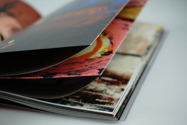
The gallery brand is not only shaped by the concept of the logo, merchandise and virtual representation on websites and social networks, but also by the people, experiences and events that are associated with Telegraph as such. In the case of the gallery, these are mainly exhibitions, the atmosphere of which is captured in the catalogues. These not only summarise the content, but help to anchor the exhibition in time and make it accessible regardless of geographical and temporal limits. They not only provide a quantitative list of the exhibits presented, but also record the experience of participating in the exhibition. How? Mainly non-verbally. This experience is mediated by graphics and design. Our graphic designer's phrase "Without graphic design, there is no catalog" applies here. It is the design that first reaches out, captivates and, moreover, gives a complete idea of the exhibition. It stimulates the imagination and speaks to the mood of the exhibition. Which is great news not only for latecomers who missed the exhibition in person, but also for visitors who want to recall its charm.
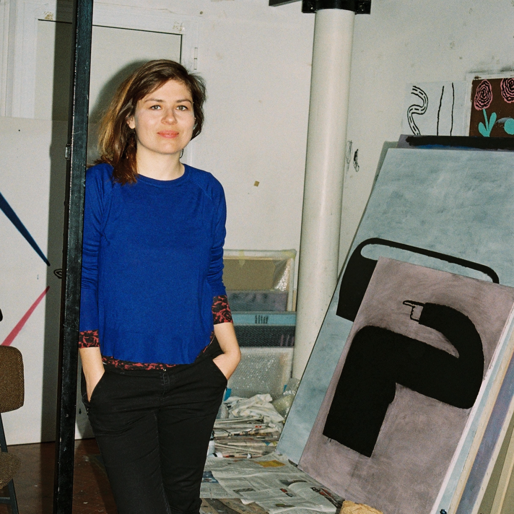
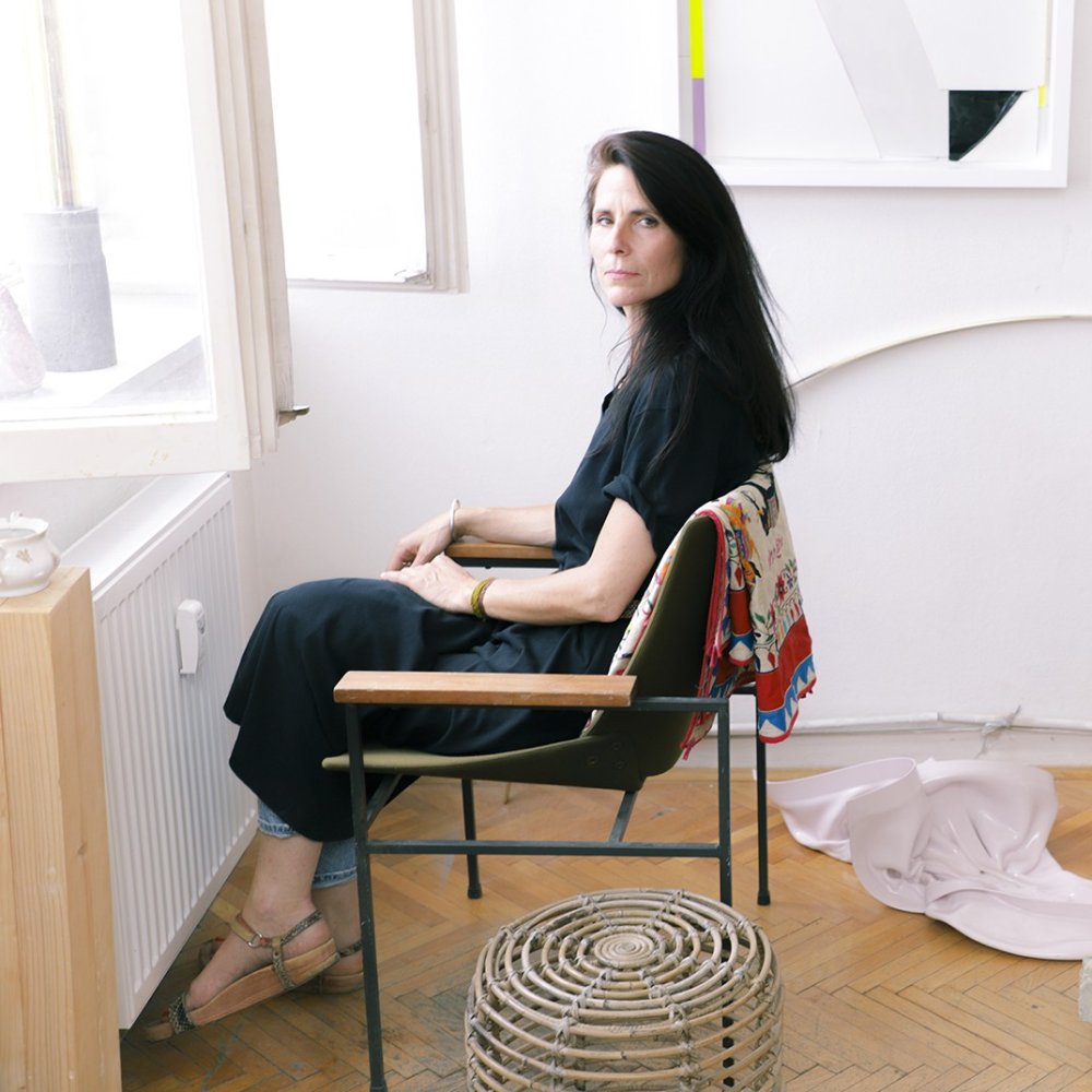
Capturing the mood of an exhibition in a visual form is a job that requires abstract thinking, intuitiveness and, of course, talent. The key name of this text is Jakub Kovařík. The graphic designer behind the Telegraph's visual identity, he has signed off on the vast majority of catalogue designs that have appeared under the Telegraph label. A graphic designer who should by no means go unnamed. James himself says of his work that his creative process is conditioned by whether or not the subject matter resonates within him. However, this resonance is by no means automatic, sometimes it needs to be actively sought. He sees the design process as a means of underlining the atmosphere already conveyed by the catalogue works, without necessarily calling for attention.
Although design is generally considered an unobtrusive aid, one can still make a list of the trace elements through which Jakub Kovařík formally expresses himself. As he says: every project is an original with a need for a distinctive approach. You can browse through the catalogues at the gallery reception. Here the catalogues are also available for purchase. From the comfort of your home, catalogues for ongoing or completed exhibitions can be purchased in our e-shop. And how does Jakub go about creating a catalogue and what is important to him? Read below.
Can you describe the typical process of creating an exhibition catalogue from start to finish? What is the approximate timeline?
The goal is to have the catalogue ready during the exhibition. The next steps are adapted to that. The last link is the printer. In recent years, due to various events in the world, the paper supply has slowed down, this slows down the whole production process and also limits it. One can only work with certain resources.
How is the theme of the exhibition reflected in the visual style of the catalogue?
The theme has to resonate in me somehow. Sometimes it takes a while to find that resonance. But in this respect I'm quite intuitive. If the curatorial concept is distinctive, it should be legible in the catalogue somehow. In an exhibition of paintings, sometimes the visible aspects - format, number of works, etc. - can matter more than the curatorial concept. But it is mainly the reproductions of the exhibited works that capture the atmosphere of the exhibition. My task is just to construct a handy vehicle.
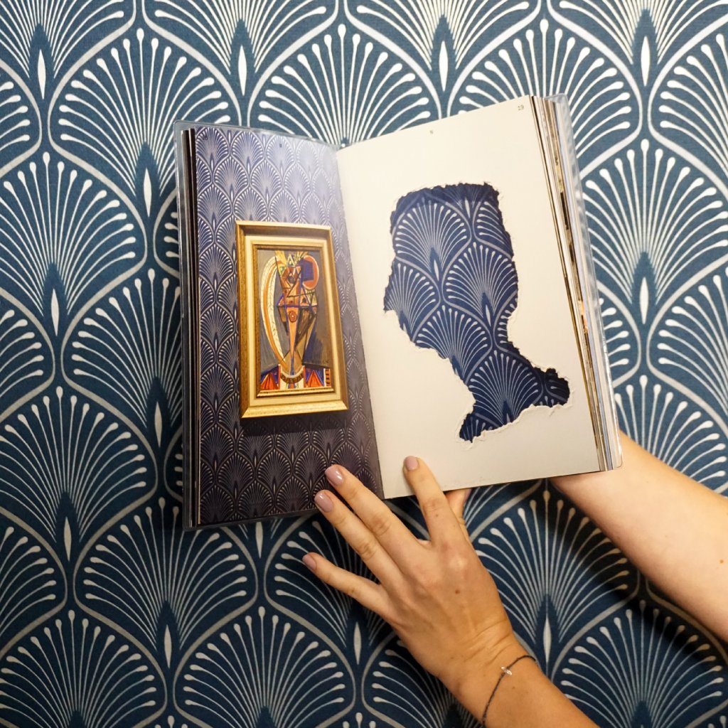
How do you try to present the exhibits/photographs in the catalogue?
Whole, detail and space. To convey the physical experience of the exhibition to the reader as much as possible. And then by arranging and sizing them to show the relationships between the works.
How do you go about choosing a catalogue format?
Again, based on the content and intuitively at the same time. Not always in the same way. It depends on the scale of the works. And it depends on the aspect ratio of both the individual works and the aspect ratio of the installation photos. For example, in the catalogue of German painting, the aspect ratios of the works were the basis. Personally, I prefer smaller, pocket-sized sizes. They are more intimate and the content is more intimate. But if there are going to be reproductions of large, detailed paintings in the catalogue, the format has to correspond to that. It's not just the format that creates intimacy.
Do you work with the exhibition curator to design the catalogue?
It's up to the curator if they have a particular idea or concept. If I don't get a brief or boundaries, I work with the character of the installation, its rhythm and structure, just the curator's thought imprint in the exhibition.
What graphic style do you think a catalogue should have? (modern, classic, minimalist, etc.)
Depending on the show. It's impossible to give a general answer. I like simplicity, directness and clarity, I like weirdness and I like details. I apply this to catalogues to very different degrees. But without a clear structure and good orientation, style is useless.
What importance do you place on the connection between graphic design and content in a catalogue?
At all? Without graphic design, there is no catalog.
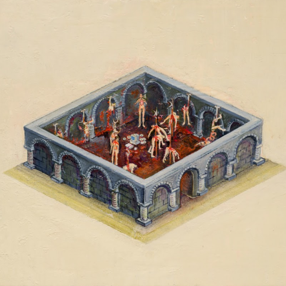
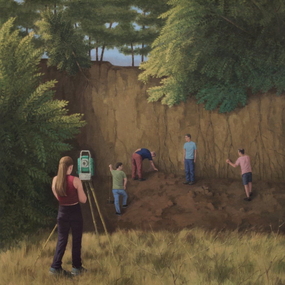
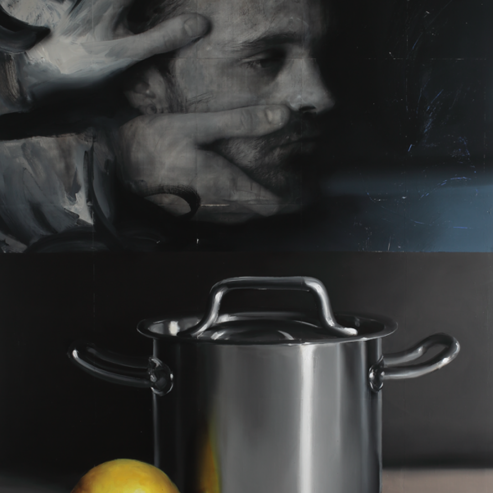
New Positions in British Painting / Brave World / Lazy 8 / Signal III / Mark Ther: May / Jan Poupé: Neuralscape / German Painting Now / SIGNAL II / Radu Baies: Searching forMy Human Traces / Ivan Pinkava: Double Bind / SIGNAL I / Petr Dub and Josef Mladejovsky: Tabula Rasa Breach / SIGNAL I / Václav Stratil: Heart in the Tongs /