Case study of our visual identity.
The author is Jakub Kovařík, a graphic designer from Olomouc.
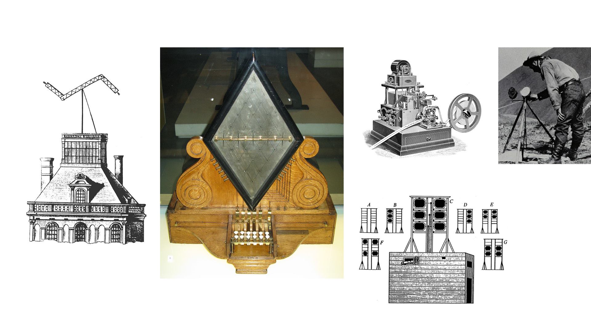
Edit: "Telegraphein" means "to write remotely" in Greek. Telegraphs are communication devices, telegraph in general is a principle of communication. Fire signals and tamtams, heliographs, optical and electric telegraphs, flag semaphores, hydraulic telegraphs or electric telegraphs: these and other devices for transmitting information before the invention of digital communication are telegraphs.
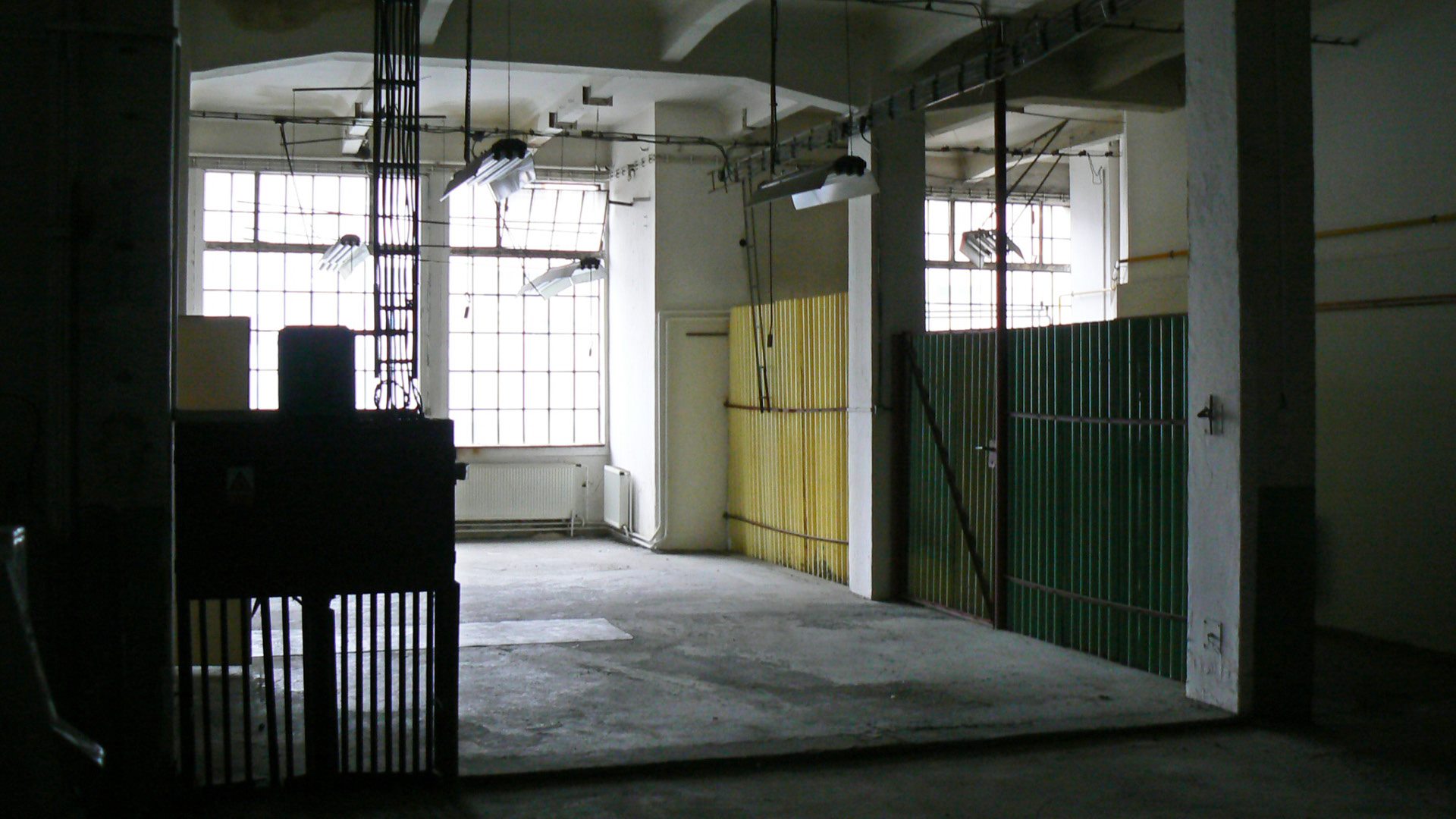
Location: the building on Jungmannova Street, where the Telegraph is located, was built a century ago as part of a telegraph and telephone factory.
Language: the telegraph is an extension of human speech. It is an interface for rapid communication that the human voice does not contain. It is both a technological device and a language of communication, a tool and a code, hardware and software.
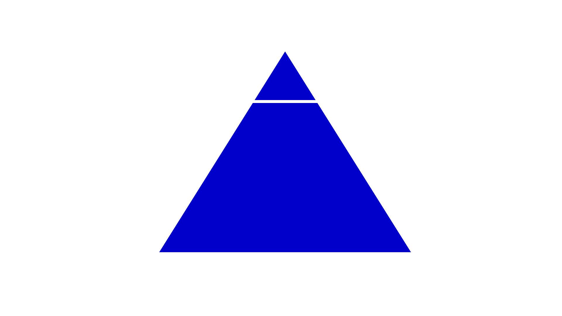
Principle: Visual styles are usually equipped with a logo as a basic communication and identification element. The logo is the hegemon, the cornerstone, the top of the pyramid of any visual identity. The Telegraph's visual style does not include a logo in the conventional sense. It replaces the unchanging, static logo with an adaptable interface based on combinations of 4 basic elements: symbol, name, font, colour. Sometimes these combinations form a "logo", other times a sign, an unintelligible code, a symbol or an image.
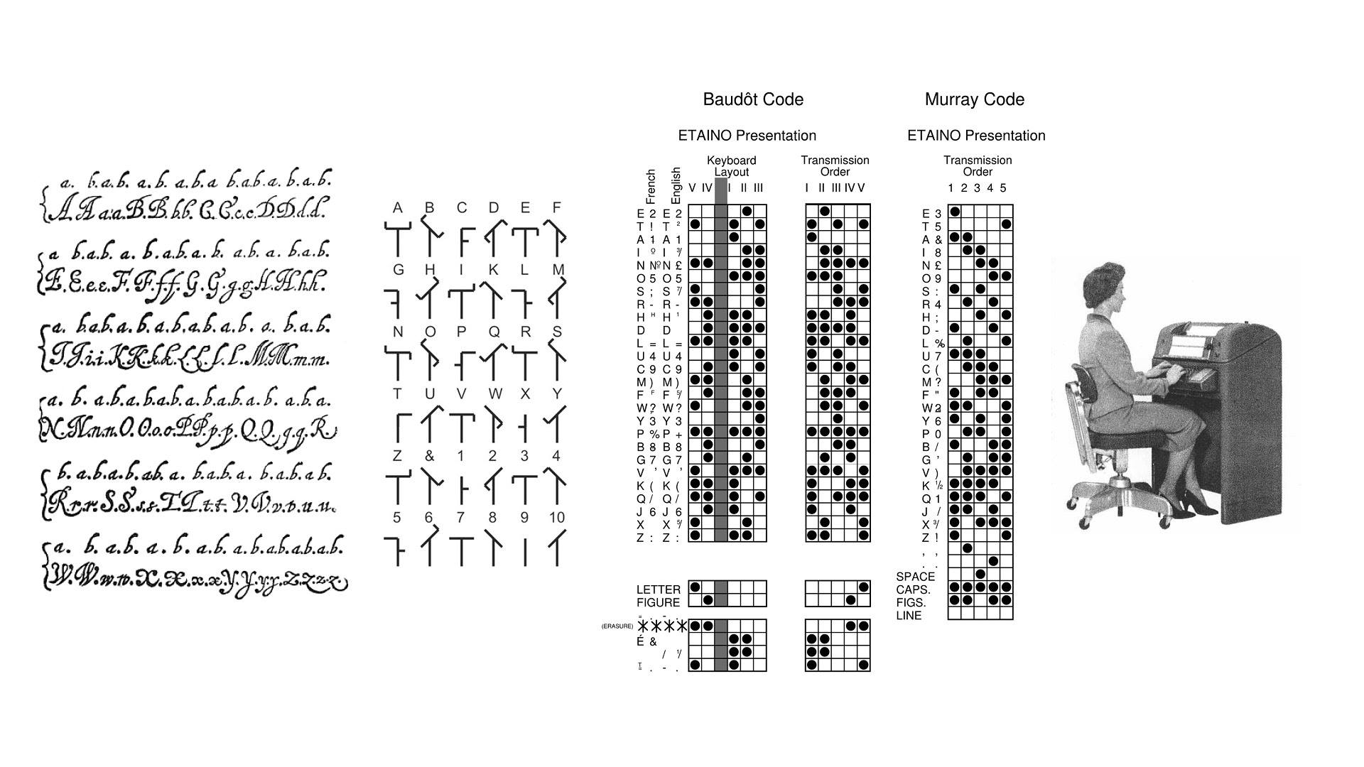
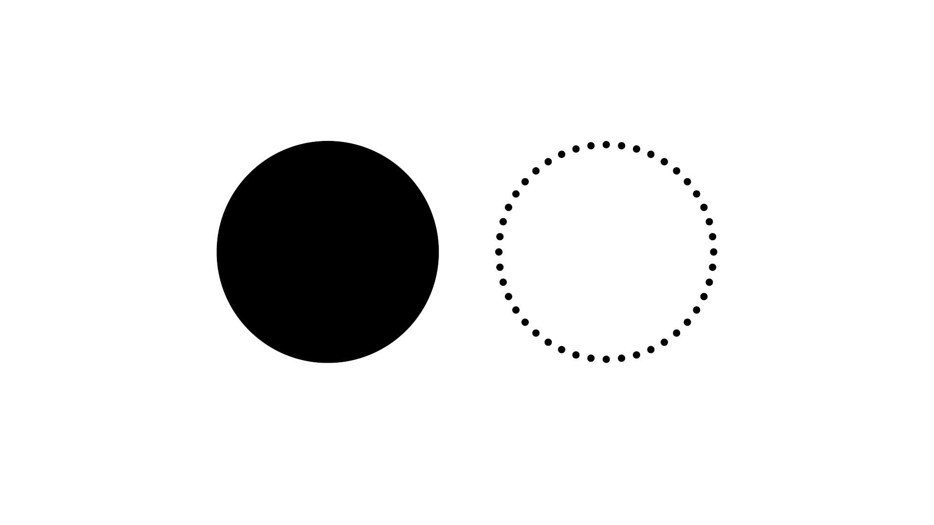
Symbol: Visualizes the binary principle that is the essence of coding not only in telegraphic languages: signal and pause, full/empty position, input/output, 0/1, yes/no, +/-. This principle is the basis of, for example, Samuel Morse's alphabet, Francis Bacon's 5-bit cipher, Murray's flap telegraph, Baudot's code for teletype, and the ASCII character standard for electronic communication.
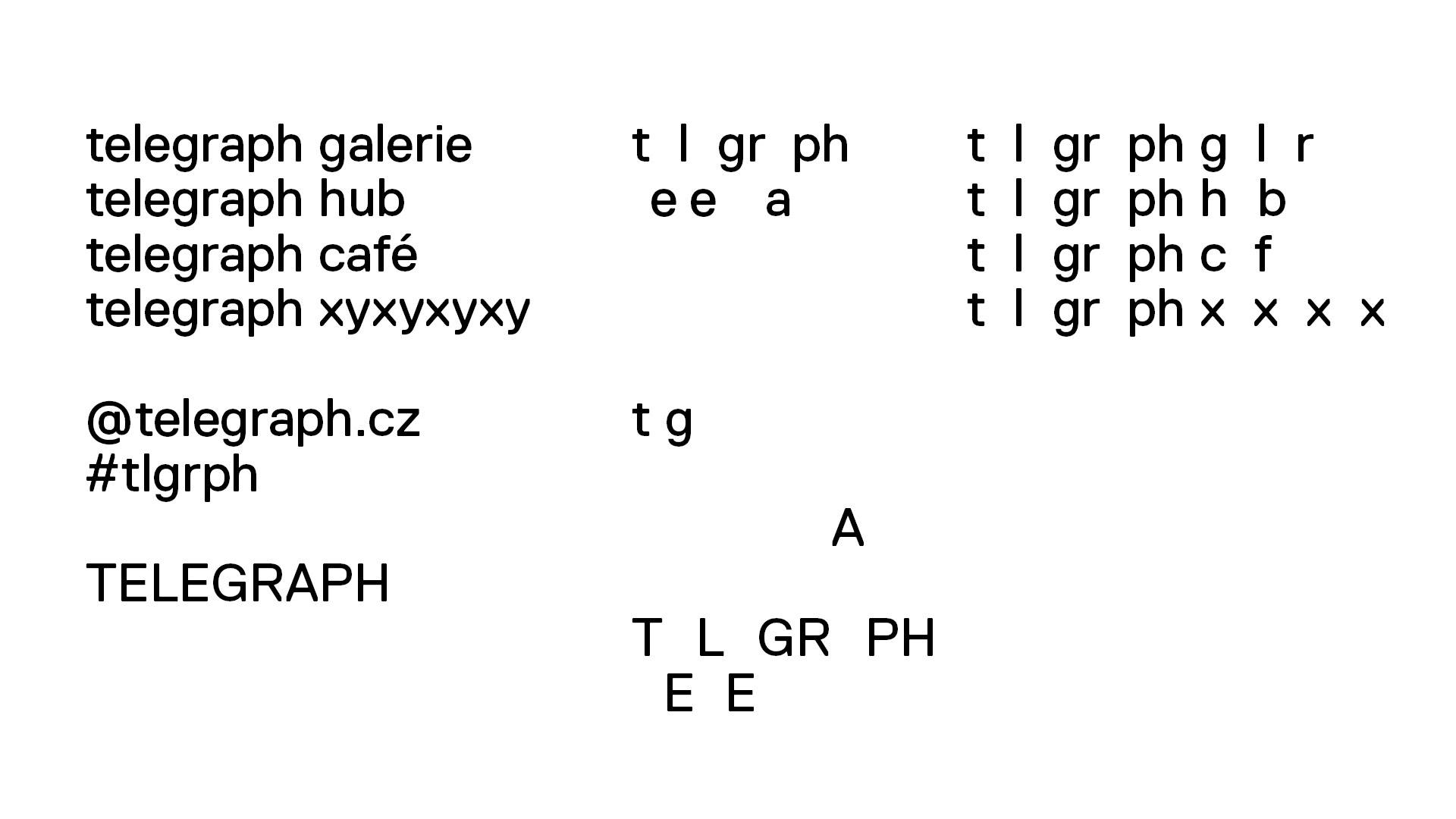
Name: Develops the binary principle of the symbol. It is like a game of hide and seek. Like the lights on a traffic light, it turns certain letters on and off on a wide range between legibility and illegibility, from the simple "telegraph" to the hashtag #tlgrph.
Color: For gallery black, white, a range of grey shades and sharp signal colours. For other parts of the Telegraph, seasonal colour sets.

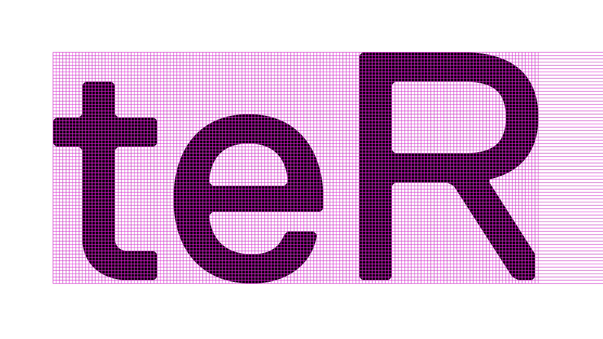
Letter: All design points of the Replica font are inscribed in a fixed grid of 70 x 70 lines. This was created by reducing the 700 x 700 grid normally used for font creation in FontLab. In its rational programming approach, its technical character, and above all its substitution of design intuition for straightforward formal principles, Replica has a similar starting point to the Telegraph's visuals. The typeface is the work of Swiss studio norm.