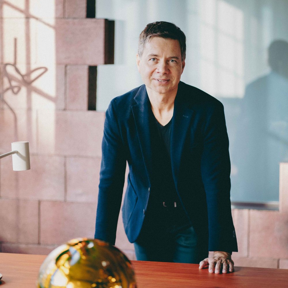
We asked Barley Studio, who handled the Telegraph's renovation, about the remodeling process, their favorite part of the building, or what to look for when visiting the cultural center. Read our interview with Lukas Blazek, the lead architect.
Tell us about the history of the former factory building on Jungmannova Street in Olomouc that you renovated into the Telegraph Cultural Centre. Do you also have historical photographs available?
The Telegraph building is the torso of the disappeared site of Robert von Lieben's telephone and telegraph factory. The person of the factory owner is also the inventor of the amplifying lamp. The business became part of a joint-stock telephone company based in Hanover, Germany, in the early 20th century. After the First World War, the factory passed into the domestic hands of the joint-stock company Telegrafia. It was between the wars that Telegraph's own building was built. In the 1930s, electrical production ceases and the premises are used for various purposes. After nationalisation, the Telegraph building was used by the engineering company TOS, and was an apprenticeship centre.
Historic plans have unfortunately not survived. Photographs are not available. It would make us very happy if photos would surface over time. A historical summary was provided by architectural historian Lukáš Beran from the Research Institute of Industrial Heritage Prague.
Did you try to preserve the original structure, the structure of the building?
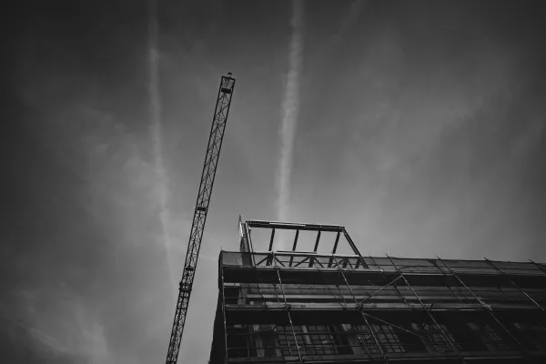
We were given a brief that could not fit into the original building. Logically, an extension was built. However, the subtle reinforced concrete skeleton, which is unique in Olomouc, was not designed for an extension. This was followed by strengthening of the foundations with micropiles, bandage of columns and other complex structural securing. We managed to preserve the lightness of the industrial building. In addition, as a historical trace, we leave the concrete ceiling with stabilized traces of the building's centuries of industrial use. Now the building is entering a new era. From industry to art and urban life. The exterior has a new coat - the facade in the form of a handmade pale blue plaster. It is ragged and contrasts with the order of the original factory windows.
What materials did you use in renovating the building? Did you try to preserve the original materials?
The Telegraph is operationally a sandwich. Gallery - cowork - cafe with atrium - apartment and guest studio, lounge extension with roof garden. So a mix of functions. All in one building. Or rather in a historic building with a new extension. The superstructure is a light box on a reinforced concrete frame. The reasons are twofold: the architectural concept - we wanted to think like a factory owner, when the existing space is not enough, he sets up the superstructure from the current material, i.e. lightweight panels. And the second reason is statics. The building really couldn't support additional brick or concrete floors. The material solution corresponds to this consideration. The historic building is as exposed as possible, the original concrete ceilings, etc... And in this context, light modern glass buildings are inserted. The new superstructure is made of industrial panels used in logistics warehouses on the periphery. But in a precise design. The part of the superstructure that serves the technology of the building (air conditioning, heating, warehouses...) is wrapped in a galvanized mesh network.
Which part of the building is the most popular for you and which one gave you the most trouble?
This multi-storey industrial building has a simple plan. The staircase runs through the whole building and serves the individual floors. This has been retained. We have inserted a wall of pink acoustic bricks into the building. It divides the roads and the individual industries. As the building is a regular skeleton, we had to incorporate the sanitary facilities and storage into the staircase section. That was difficult.
There are more popular places. For example, the open atrium with bleacher seating that is part of the café will be a very nice place.
What "gadgets" can we look forward to that we should notice as we walk through the building
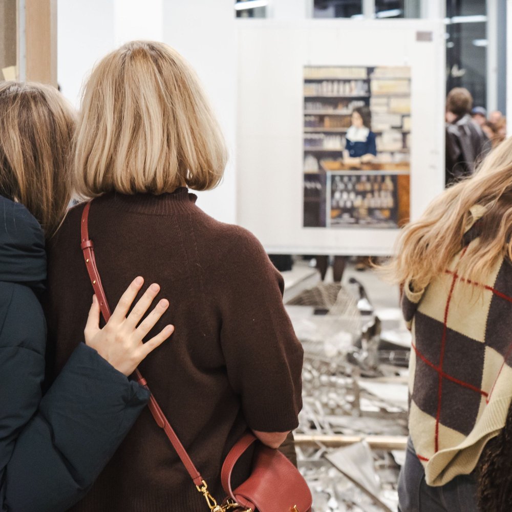
The building is seemingly ordinary, but that's just the first glance. It is difficult to hide all the installations and necessary equipment. This has been done here. A pleasant space has been created on each floor. The building is a backdrop for art. Outside the gallery, the exhibitions will be in the skylight, which is the space above the entrance that runs parallel to the staircase through the whole building. On your way to the café, you observe the art with light falling on it from above. We have workingly named the lounge in the extension "the art lover's apartment". The interior is an elevated space with a gallery from which the exhibited paintings mounted on theatrical tracks will be observed. The variation of the display of paintings is endless.
The idea of the building as a backdrop for art, rather than the building itself as an exhibition of architecture, has been brought to reality in the gable to the station, where a space for light and art installations is created above the gallery. There is also a graffiti wall at the entrance on the façade. And above the main entrance façade is a continuous gallery for art. The building's signage is a mobile made of stainless steel polished lenses spinning in the wind. And there's more.
The building was being remodeled during the coronavirus era, when it made daily life difficult for several residents. Did you encounter complications too? How did you resolve them?
The telegraph is being completed, there is no time for restrictions with us, we are working flat out. Construction has inertia, I expect a crisis in the fall, by then the building will be finished. Of course, during the curtailment period, supplies and staffing of craftsmen are complicated.
You have been renovating the community center building for more than 2 years. What place does it occupy in your portfolio?
Unique. Thanks to the great trust of the investor and the care of the builder, the building is being created with a variety of original solutions. This means that we developed unique details just for this building, we did not put together ready-made solutions. It's not often that we see an operation like this, especially in the region.
The correctness of the concept will be verified by the operation. What are you most looking forward to from the whole building?
I'm looking forward to a vibrant building that will be open all day. Work, play, education all in one place. The mix of features is guaranteed to bring the place to life. Today a tucked away building will light up. I wish Robert Runták that the gallery will have a Central European resonance. And I hope that the users will have a smile on their faces when the building is put into use.
Away from the Telegraph, Barley Studio is currently completing a funeral parlour in Zábřeh or the redevelopment of the university building at 17 Kateřinská Street in Olomouc, a building with a new corner tower in the historic centre. Furthermore, the new city block of Šantova. Their portfolio includes buildings ranging from interiors, residential buildings, recreational areas, industry to landscape and urban planning.
Barley Studio's portfolio can be viewed on their website.
-
By Vera D., Telegraph Gallery
